

This piece could change from a short piece to a Faulknerian narrative, but I am going to try spare all the “streams of consciousness” to keep it short.
I would watch the video if you can, as it covers the main points.
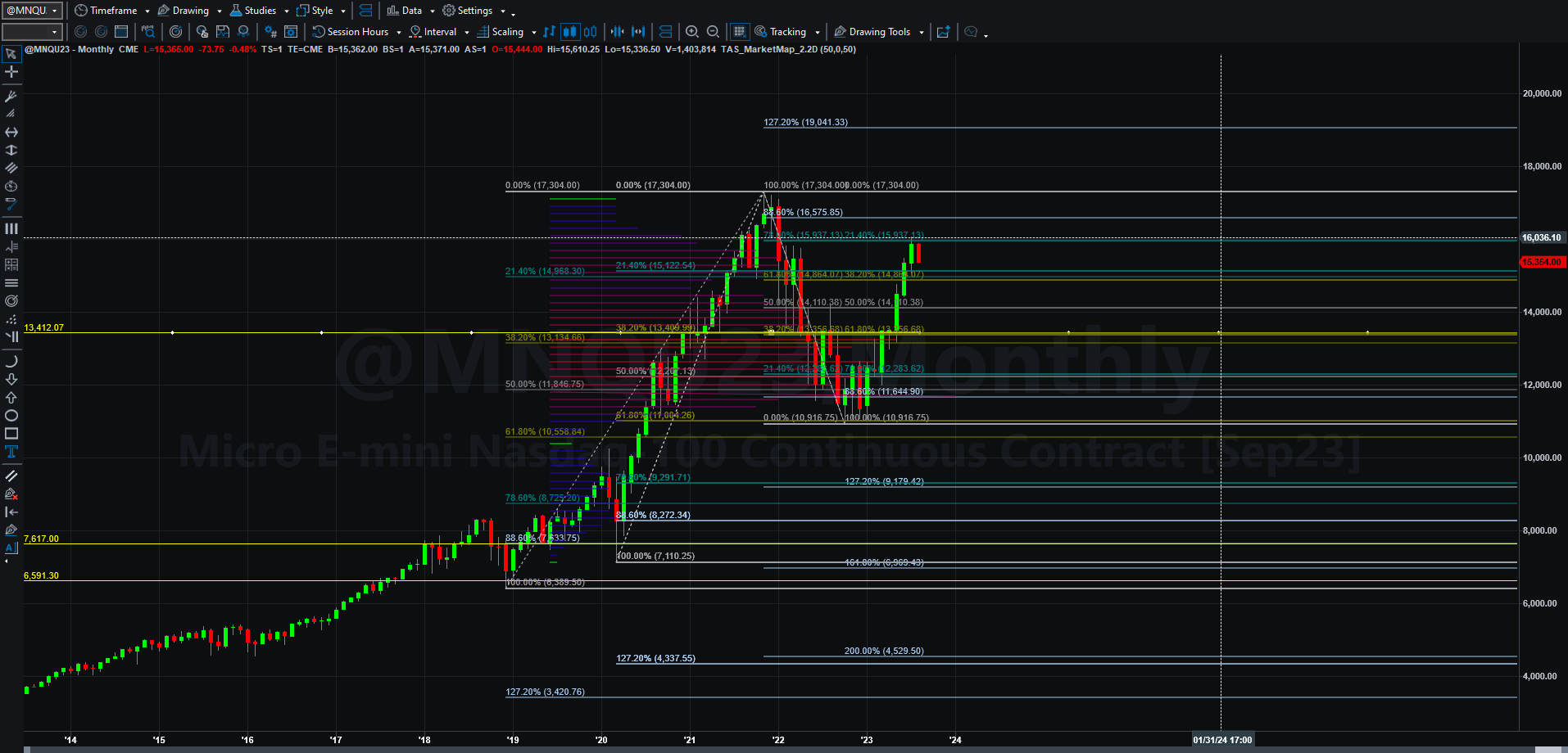
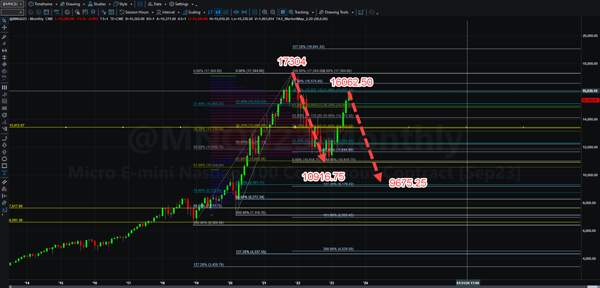
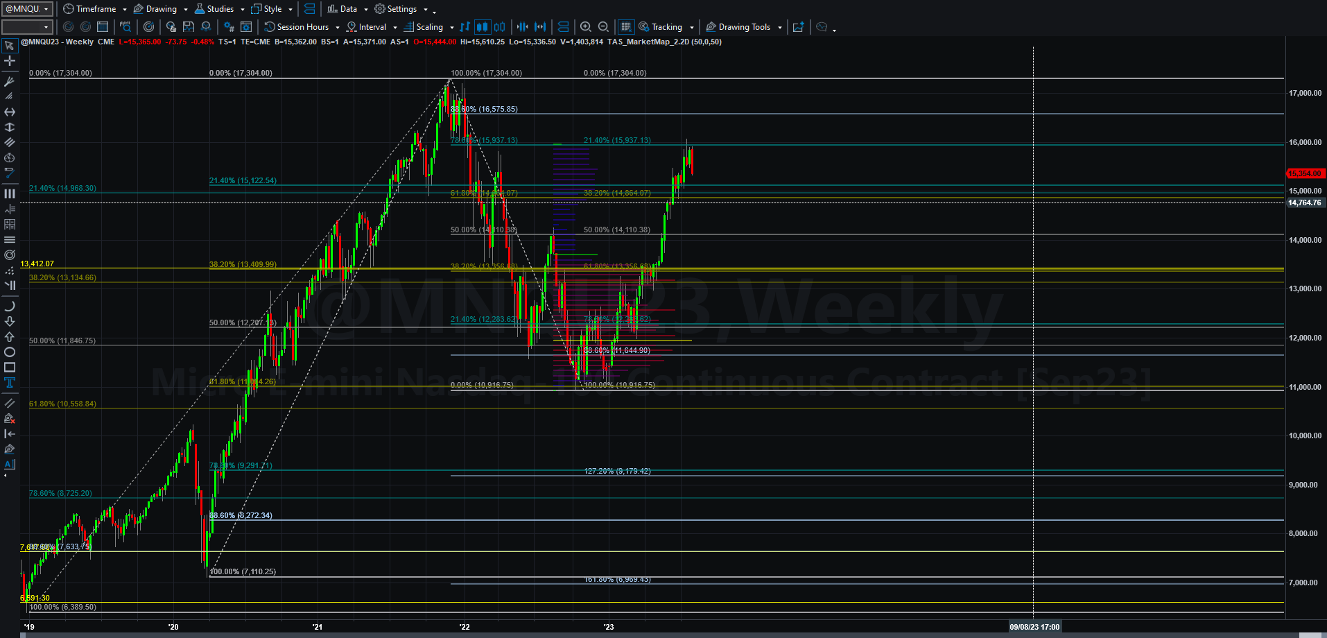
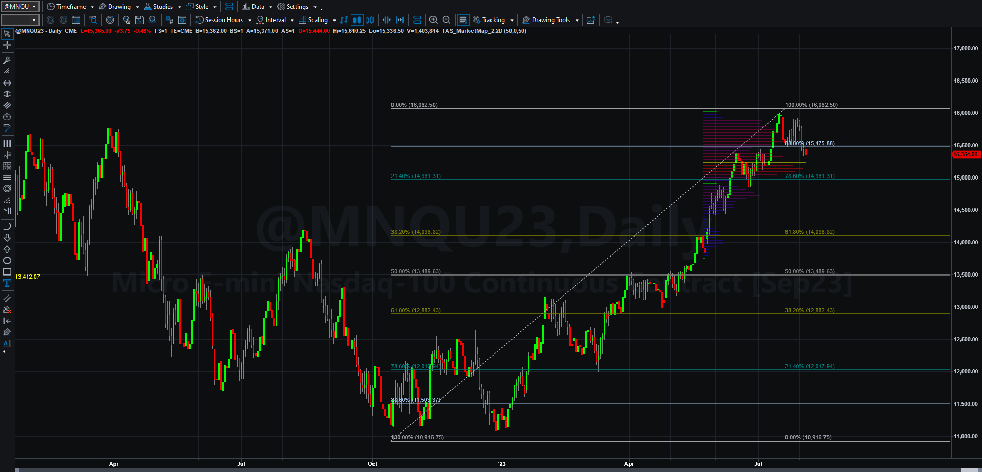
Monthly runs from the beginning, weekly starts at 7:08, and the daily starts at 12:25. What the charts you will see below represent are the basic charts presented in the video with the addition of charts that provide potential targets. All if it assumes relative price and time symmetry, though of late, it ends up that price symmetry will end up being the primary factor over time symmetry, largely because of the news cycles that increase volatility in both directions.
Before I get going, I often use Game of Trades YouTube videos as they do a great job of simplifying complex or confusing economic concepts that I may discuss. I do not promote Game of Trades subscriptions nor am I paid by Game of Trades in any way. I just like the way the present data.
Here are the charts:
Monthly MNQU23 Chart
Monthly MNQU23 Chart with Targets (Bearish) Bullish can be found on previous weekly analyses).
Weekly MNQU23 Chart
Daily MNQU23 Chart:
Daily MNQU23 Chart with Bullish Target:
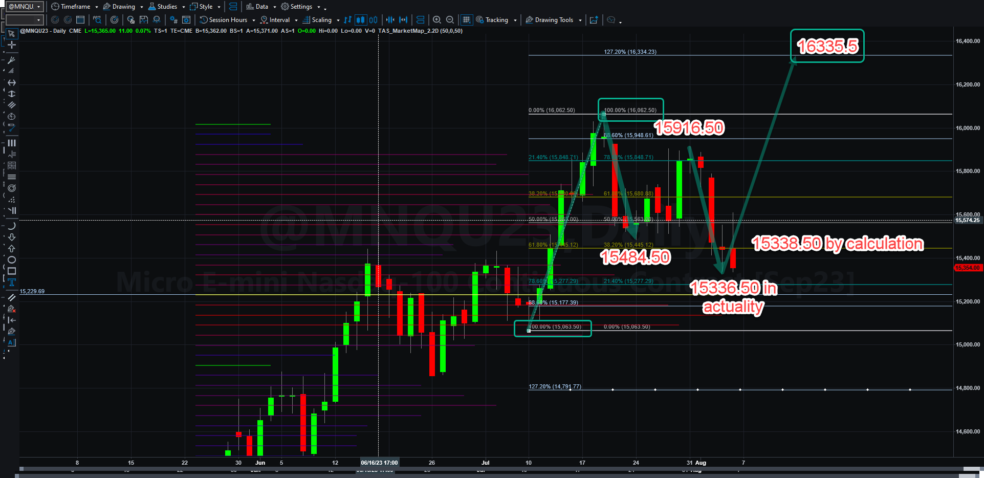
The daily MNQU23 bullish target is based on the formation of a bullish Gartley pattern with nearly perfect price and time symmetry. What would have to happen for this to occur would be 1) support to hold at that 15336 low and 2) for the rally to progress fully to the 127.2% of the previous upswing to 16335.50. If that support doesn’t hold, then there will be continued selling behind it. We simply have to see what happens next week.
If there is a correction, is it because we are now seeing the market react to a coming recession? Actually, no one has a clear idea, but history has shown us some pretty clear evidence from previous history.
I am going to add some video and referenced graphical data to make a point.
Even though this yield curve inversion we have had is as severe as the one in 1928, it is hard to know how long the rally can sustain itself (watch the video to get a picture of this.). As in 1928, these markets could rally to new higher highs before taking a nose dive or a severe correction. They could also meander in no-man’s-land for years as well. The point is, it does look like a recession is ahead of us.
One other indication of recession is the sharp decline in housing demand, as demonstrated in this video. Housing crashes or large declines in sales lead to declines in other elements of the economy like durable goods sales (furniture, hardware, appliances, cars) and other things people buy with new homes. So far consumer spending has held up the attacking the piggy bank for savings after the ‘covidiocy’, but those savings have now dwindled. What happens next is likely a slowdown.
This other chart from MacroEdge is also intriguing:
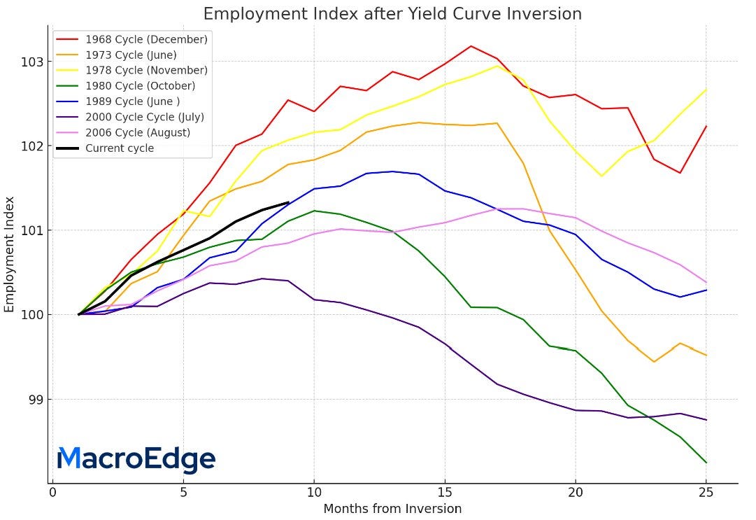
The chart above shows where the US economy’s employment index is in the current yield curve inversion relative to others. We are just now perhaps hitting a apex in employment on the way to a rollover. How long that can take is anyone’s guess.
What is really scary is this. In the third quarter 2023 alone is 1 trillion dollars! (that is a $4 trillion annualized rate). That will add even more to interest payments (as that money will be printed) leading us closer to $1 trillon in Federal interest payments alone. If the dollar further weakens, foreign investors will want a higher return on the borrowed funds. That will lead to higher interest rates for Treasury bonds, and that will filter through the economy. The Fed is overspending on everything including the Ukraine-cluster.
The Fed also seems determined to continue tightening and it cannot seem to get a handle on business productivity, so its need to tighten maybe warped by bad data too.
The only thing I can tell you is that I am going to follow the charts to gauge direction, as we seem to have tons of conflicting data, media propaganda, and political subterfuge in Washington D.C. Companies like BlackRock who only look good when the portfolio is green will push the idea that equities are forever rising when everyone knows they do not. I am just going to keep a watchful eye, trade at the margin in either direction, and look for clues of better valuations and better bullish atmospheres to go long and stay long again. I am certainly not quite there yet!
That’s all for me today. Have a wonderful week this week!

